Vertical Spacing
Use the design system to lay out the content on your service’s pages vertically in a uniform and consisted manner.
Understanding the spacing scale
The spacing scale displays the various spacing achievable between items.
| Spacing Unit | Rem | Pixels |
|---|---|---|
| 0 | 0 | 0 |
| 1 | 0.25 | 4 |
| 2 | 0.5 | 8 |
| 3 | 0.75 | 12 |
| 4 | 1 | 16 |
| 5 | 1.25 | 20 |
| 6 | 1.5 | 24 |
| 7 | 1.75 | 28 |
| 8 | 2 | 32 |
| 9 | 2.25 | 36 |
| 10 | 2.5 | 40 |
| 11 | 2.75 | 44 |
| 12 | 3 | 48 |
| 16 | 4 | 64 |
| 20 | 5 | 80 |
Elements spacing values
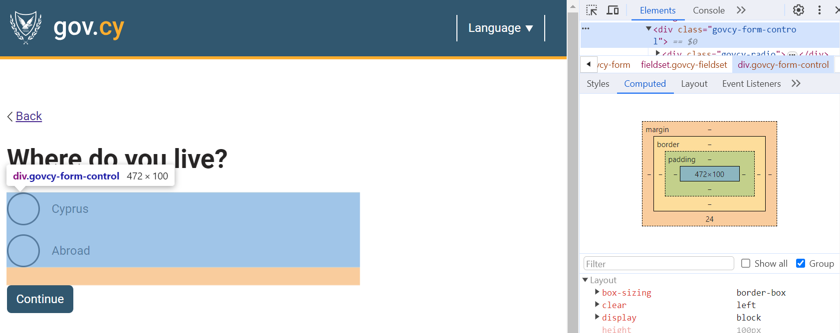
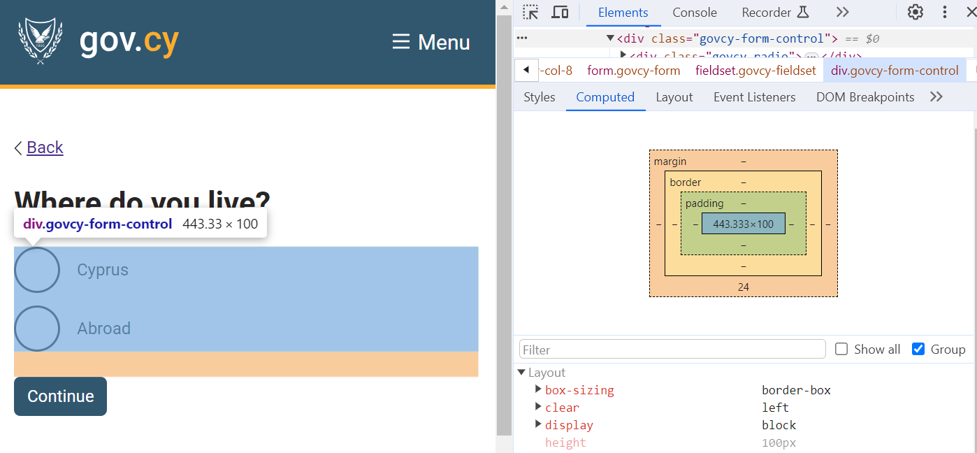
The system uses a combination padding and margin attributes on each element to manage vertical spacing.
The elements spacing for ‘large screens’ is used when the screen is wider than the responsive breakpoint (767px), whereas for smaller screens heading spacing begins from the responsive breakpoint and below.
The following spacing values must be applied:
Large Screens 768+
| H1 | H2 | H3 | H4 | P/ul/ol | Pictures | Components | |
|---|---|---|---|---|---|---|---|
| Top | 0px | 20px | 20px | 20px | 0px | 0px | 0px |
| Bottom | 24px | 24px | 24px | 24px | 24px | 24px | 24px |
Smaller Screens 767 and below
| H1 | H2 | H3 | H4 | P/u/ol | Pictures | Components | |
|---|---|---|---|---|---|---|---|
| Top | 0px | 12px | 12px | 12px | 0px | 0px | 0px |
| Bottom | 24px | 24px | 24px | 24px | 24px | 24px | 24px |
Header spacing values
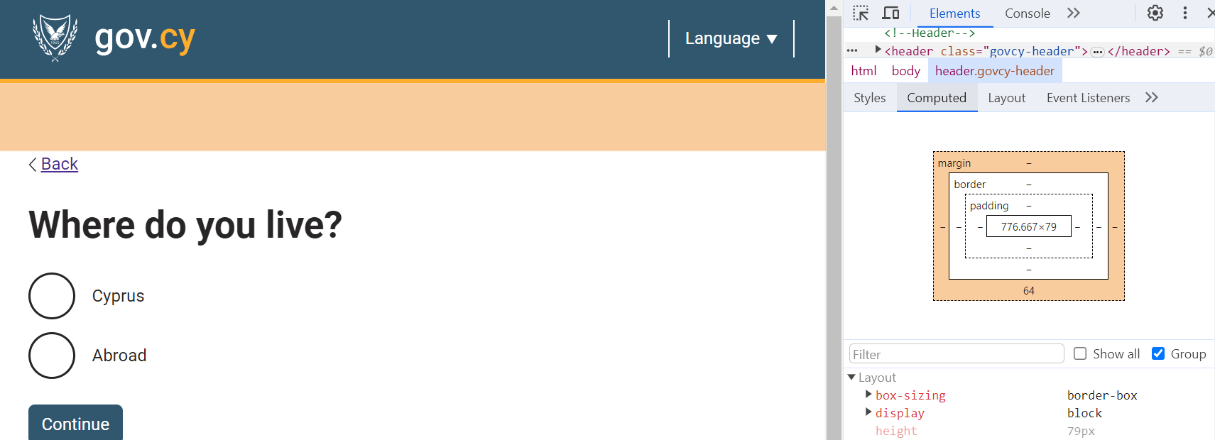
The header spacing concerns the vertical spacing of the header section of the page template.
The following spacing values must be applied:
| Large screens (768px+) | Smaller screens (767px and below) |
|---|---|
| 0px Top | 0px Top |
| 64px Bottom | 44px Bottom |
Spacing after the header
In order to achieve the spacing values for the header, consider which element follows the header.
Usually the first element after the header is either a back link, a breadcrumb or a H1 title of the page which already have top margin 0px, and there is no need for special care.
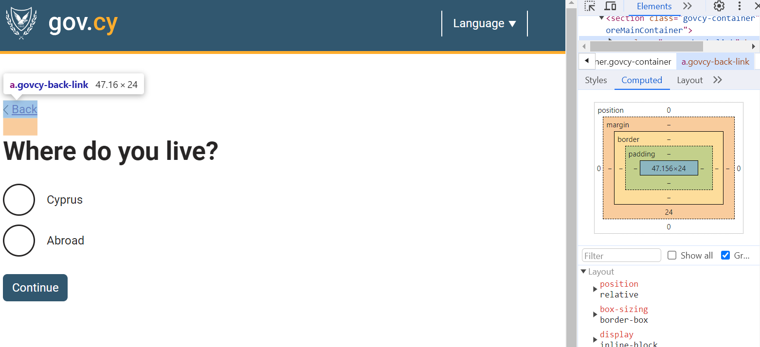
On the other hand, if the following element has pre-existing top spacing, such as an H2, the spacing between the header and H2 will combine to 84px which should be avoided (the 84px spacing comes from the existing 64px bottom of the header plus the 20px top of the H2).
This means the FIRST element right after the header, should always have 0px top spacing so as not to interfere with the header spacing.
If the first element is not a back link, a breadcrumb or a H1 title, use the govcy-pt-0 class achieve the correct spacing as shown in the example below:
Example
Lorem Ipsum
HTML code
<h2 class="govcy-pt-0">Lorem Ipsum</h2>Footer spacing values
The footer spacing concerns the vertical spacing of the footer section of the page template.
The following spacing values must be applied:
| Large screens (768px+) | Smaller screens (767px and below) |
|---|---|
| 40px Top | 20px Top |
| 0px Bottom | 0px Bottom |
Unlike the header there is no need for any adjustments to elements on top of the footer.
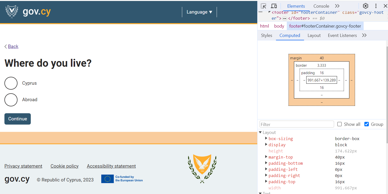
Spacing with gov.cy CSS
Using our developers assets and the code in our documentation, the vertical spacing is adjusted automatically.
Custom components
If you are implementing a custom component that is not included in our documentation, you can use the margin utility classes. To achieve the bottom margin of 24px that all elements have, use the govcy-mb-6 class.