Layout
Use these layouts for content that resides inside the <main> element of the page template. The screenshot below shows a representation of the area which the layouts apply to.
Services
When implementing a service, use one of the following layouts.
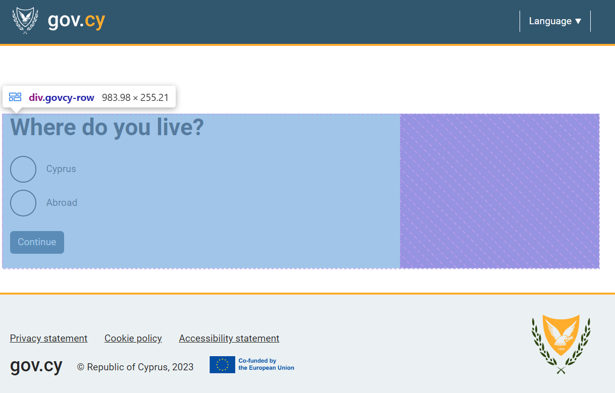
Two-thirds layout (recommended)
This layout uses one column and takes up the two thirds of the <main>.
Example
HTML code
<main class="govcy-container" id="mainContainer">
    <div class="govcy-row">
        <article class="govcy-col-8">
            Two thirds
        </article>
    </div>
</main>
When to use this
For most services, we recommend using this layout as it stops lines of text getting so long that the page becomes difficult to read on desktop devices. This would usually mean no more than 60 characters per line.
Use this layout when there is no need for a side menu and when components do not require the use of the full width of the page.
Max-width layout
This layout uses one column and takes up the full size of the <main>.
Example
HTML code
<main class="govcy-container" id="mainContainer">
    <div class="govcy-row">
        <article class="govcy-col-12">
             Full width
        </article>
    </div>
</main>
When to use this
Use this layout when there is no need for a side menu and when components require the use of the full width of the page.
One-third + Two-thirds layout
This layout uses two columns:
- The
<aside>container that appears on the left of the<article>container on Desktop screens. It’s width takes ⅓ of the<main>section. - The
<article>container that appears on the right of the<aside>container on Desktop screens. It’s width takes ⅔ of the<main>section.
Example
HTML code
<main class="govcy-container" id="mainContainer">
	<div class="govcy-row">
		<aside  class="govcy-col-4">
			One third
		</aside>
		<article  class="govcy-col-8">
			Two third
		</article>
	</div>
</main>
When to use this
Use this layout for services that need a side menu.
Avoid using side menus in your services with links to other services. Presenting links to other services in the main section, could disrupt the users' flow within the service and they should be avoided.
Websites
When implementing a website, you can use a combination of the following layouts.
Full width
Example
HTML code
<div class="govcy-container">
    <div class="govcy-row">
        <div class="govcy-col-12">
             Full width
        </div>
    </div>
</div>
One half
Example
HTML code
<div class="govcy-container">
    <div class="govcy-row">
        <div class="govcy-col-6">
            One half
        </div>
    </div>
</div>
One third
Example
HTML code
<div class="govcy-container">
    <div class="govcy-row">
        <div class="govcy-col-4">
            One third
        </div>
    </div>
</div>
Two thirds
Example
HTML code
<div class="govcy-container">
    <div class="govcy-row">
        <div class="govcy-col-8">
            Two thirds
        </div>
    </div>
</div>
One quarter
Example
HTML code
<div class="govcy-container">
    <div class="govcy-row">
        <div class="govcy-col-3">
            One quarter
        </div>
    </div>
</div>
Three quarters
Example
HTML code
<div class="govcy-container">
    <div class="govcy-row">
        <div class="govcy-col-9">
            Three quarters
        </div>
    </div>
</div>
One Third + Two Thirds
Example
HTML code
<div class="govcy-row">
    <div class="govcy-col-4">
        One third
    </div>
    <div class="govcy-col-8">
        Two third
    </div>
</div>
Example combinations
Example
HTML code
<div class="govcy-container">
    <div class="govcy-row">
        <div class=”col-12”>
            Full width
        </div>
    </div>
    <div class="govcy-row">
        <div class="govcy-col-6">
            One half
        </div>
        <div class="govcy-col-6">
            One half
        </div>
    </div>
    <div class="govcy-row">
        <div class="govcy-col-8">
            Two thirds
        </div>
        <div class="govcy-col-4">
            One third
        </div>
    </div>
    <div class="govcy-row">
        <div class="govcy-col-4">
            One third
        </div>
        <div class="govcy-col-8">
            Two thirds
        </div>
    </div>
    <div class="govcy-row">
        <div class="govcy-col-9">
            Three quarters
        </div>
        <div class="govcy-col-3">
            One quarter
        </div>
    </div>
    <div class="govcy-row">
        <div class="govcy-col-3">
            One quarter
        </div>
        <div class="govcy-col-9">
            Three quarters
        </div>
    </div>
</div>
Nested grids
Example
Two thirds
HTML code
<div class="govcy-container">
    <div class="govcy-row">
        <div class="govcy-col-8">
            <p>Two thirds</p>
            <div class="govcy-row">
                <div class="govcy-col-6">
                    One half
                </div>
                <div class="govcy-col-6">
                    One half
                </div>
            </div>
        </div>
    </div>
</div>
Layouts with gov.cy CSS
Using our developers assets and the code in our documentation within the main section, layouts adjust automatically.